Category Archives: Case

Publyon, beyond public affairs

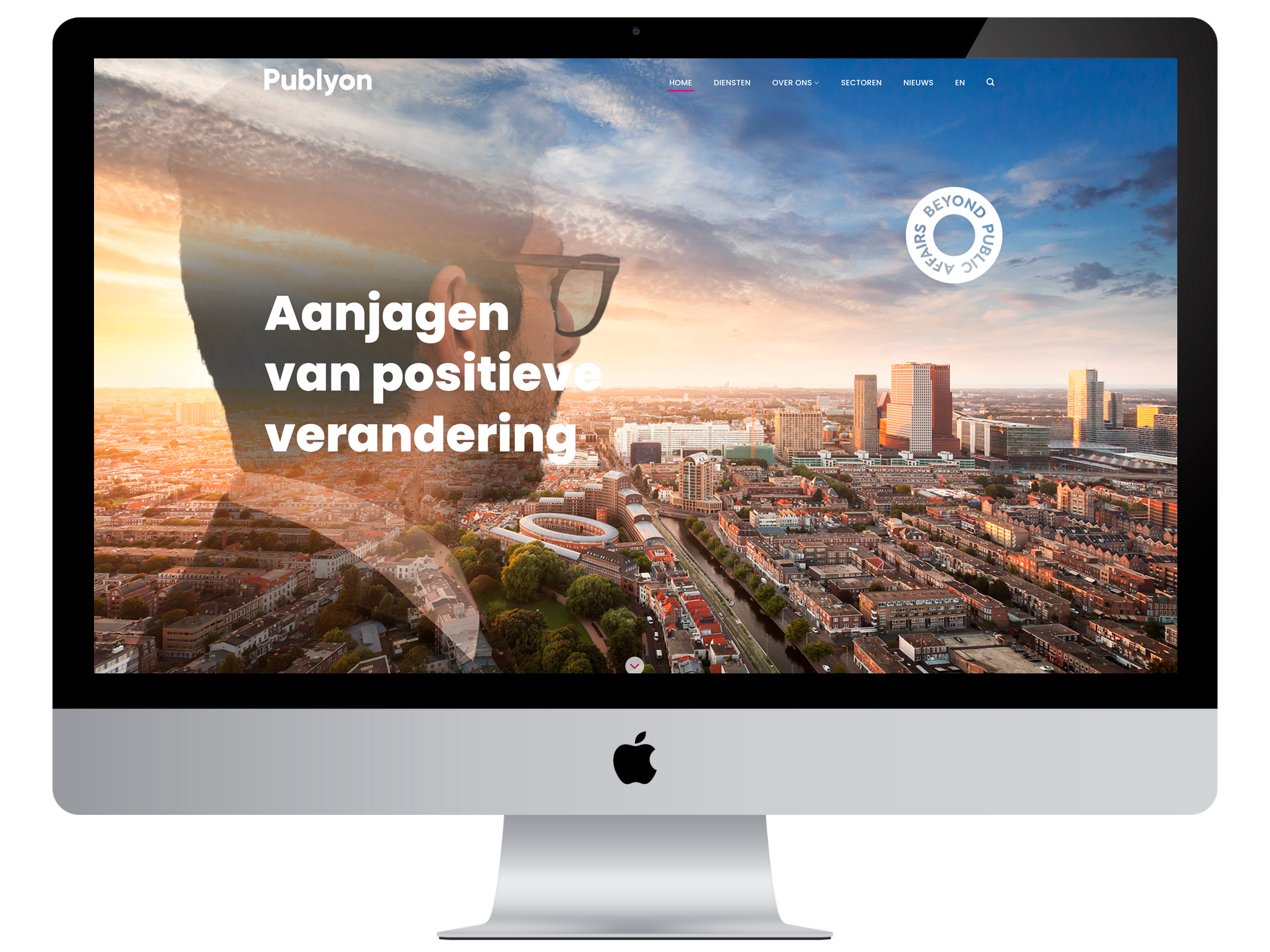
New name, new positioning

Publyon is the new name of DR2, a Dutch-origin public affairs agency with offices in The Hague, Utrecht, Brussels, Copenhagen, and New York. The name change coincided with a refinement of their services. A similar refinement was desired for the visual identity on their website. This was the task given to Brandcode by Publyon. You can view the result here.

“A good website has a distinctive and recognizable style, which essentially says everything about the brand.”

Tom Straathof
Developer

Portrait Photography in a More Relaxed Style

Public affairs advisors operate at the highest executive levels, traditionally adhering to formal etiquette. However, there is also a trend toward more open communication and (slightly) more casual clothing styles. Publyon is at the forefront of this trend, and their employees reflect this. Our photographer chose spontaneous sessions in their own office environment. Through careful lighting, they still maintain a clear, consistent style. The team page thus contributes to the brand.

Rebranding is always high stakes. The new brand must be embraced as quickly as possible by both existing and new relationships.
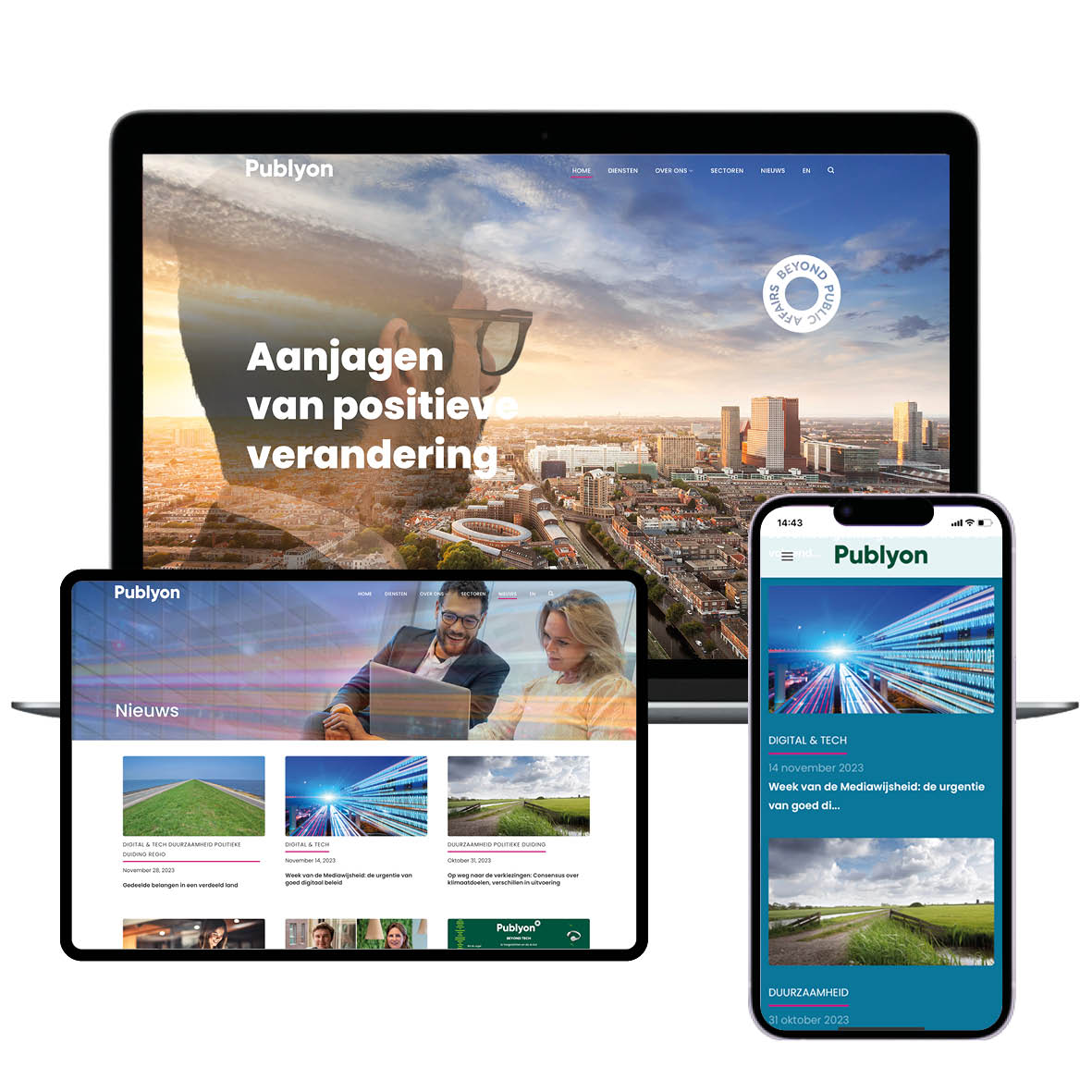
Simpler and clearer

Instead of six websites, Publyon now has one international website for all locations. Visitors can easily find the right advisor with just a few clicks. In addition to web design and portrait photography, Brandcode handled the image curation and photo editing. Publyon can now select images from the image library to accompany news articles.

A New Brand is Born

A name change inevitably leads to some discomfort and a decline in brand awareness. For Publyon, however, this lasted only a short time. The name clearly refers to public affairs. And the website confidently establishes a new brand that looks toward the future. The brand promise aligns perfectly: driving positive change.

TO NEXT CASE

Coca-Cola - let’s open it!

Verdouw

Verdouw wanted to strengthen the visual power of their brand with a new image library that reflects the versatility of their business. The photography had to align with their updated branding and be flexible for various formats, from vertical and horizontal images to circular crop-outs.

It was fantastic to capture Verdouw’s craftsmanship with images that are both authentic and representative of their brand.

Conny Huft
Fotograaf

Our Approach

Over several days, we photographed various sets, from staff in action to capturing products, the building, and trucks. The images were carefully tailored to Verdouw’s brand identity and design requirements, ensuring they are versatile for both online and offline use.

Result

The new image library provides Verdouw with an extensive collection of images that are consistent with their updated brand identity. They now have a flexible and dynamic image library that can easily be used in their marketing materials.

TO NEXT CASE

Publyon, beyond public affairs

Spirit4You

Spirit4You plays a crucial role in the Haaglanden region by supporting young people and education professionals in transitioning to further education and the job market.

However, their communication lacked cohesion. Different styles were used inconsistently, making Spirit4You not always recognizable as the sender. Additionally, a clear positioning as an authority was missing—something essential to their mission.

Through a consistent visual language and bold colors, a style emerges that radiates direction and movement.

Martine Bruyn
Designer

Visual Identity

We developed a visual identity that reinforces the core values of Spirit4You: inspire, activate, and support. This resulted in a powerful logo with an ‘eye’ element, symbolizing focus on the future and guidance. The recognizable visual language with dynamic arrows expresses direction and movement, essential for the journey to further education and work. The color scheme strengthens the message: green for progress, red for energy.

We developed a ‘Powered by’ label, so that in communications where Spirit4You is not the main brand, such as Bekijk je Toekomst, it is always clear that Spirit4You is the sender.

The Result

With the new visual identity, Spirit4You radiates authority, structure, and professionalism. The branding ensures clear recognition and strengthens their role as a trusted guide for both education professionals and young people. Spirit4You is now clearly positioned as the brand for education professionals, while remaining visible as the sender with their labels for young people. The visual identity is consistent, powerful, and reflects their mission to successfully guide both target groups into the future.

Building a fresh branding

Rebranding for BouwGarant

BouwGarant is the largest construction certification organization in the Netherlands. Their brand has been around for over 25 years. Over the years, the house style had become inconsistent due to interim changes. So time for a refresh! BouwGarant has asked several design agencies to make a proposal. Because of our extensive experience in (re)branding and our no-nonsense approach, they chose for Brandcode.

“ A carefully monitored and consistently applied house style to all communications contributes to a strong brand identity that inspires trust and loyalty.”

Martine Bruyn
Designer

Working together for a fresh brand

We started with an intake session in which we mapped out the wishes of the customer. BouwGarant wants to position itself as a brand that exudes certainty, reliability and craftsmanship. Their own members, but also consumers, must be able to recognize themselves in BouwGarant’s communications. With this information, our creative team made several design proposals. We looked at the following pillars: typography, colour, shape, image and logo. Together with the client, we determined which designs were best used to get the branding in a new, fresh line.

BouwGarant works with several agencies, so it is important that the brand is clear and consistent for everyone. With this in mind, we have developed the updated brand manual. This contains all style elements such as the use of color, the application of the logo, but also the use of images. By means of the manual it is possible to keep the house style unambiguous.

Implementation of the branding

Based on the updated brand manual, we have converted the certificates, flyers, conditions and information sheets to the new branding. With this we have provided a good basis and made it easier to apply the style on other items as well.. Such as the design of a folder that is sent to participants to store documents in, but also the animation of the BouwGarant logo. This animation is used in TV commercials and in video content on social media.


In addition to the main brand items, we have designed a booklet about the newly announced Wet kwaliteitsborging (Wkb). To explain the new law to the members in a light-hearted way, we have provided a booklet with clarifying illustrations. The booklet was part of a direct mailing campaign to provide members with more information about the new law. At the same time, the mailing was also the first announcement of an e-learning program initiated by BouwGarant. For the video lessons in the e-learning program we have also animated the illustrations from the booklet.

An advisory role

Brandcode monitors that BouwGarant’s new branding is correctly applied in all communications. As a result, in many cases we have an advisory role in the use of the updated branding. The same goes for the website. We monitor the development by the agency that creates the website and provide tailor-made advice on the digital implementation of new branding.

TO NEXT CASE

Spirit4You

Together works better

Foundation for online marketing

Exterus is the one-stop shop for businesses with international employees. The company helps expats and knowledge migrants quickly and easily adapt to their new situation. Together with Exterus, Brandcode developed a new brand story and website. These form the foundation for the company’s successful online marketing.

“For Exterus, the team’s goal was to realise a successful make-over. The overall appearance, the improved user experience and the effective use of SEO and SEA generate more traffic and leads.”

Tom Straathof
Developer

Generating more leads

What was Exterus’ original need? Generating more leads. Of course, that is something every organisation wants. No matter how much you invest in your marketing campaigns, clients will stay away as long as your website is not up to par. Before investing any money in online marketing or campaigns, it is important to make sure your story and your website are in order.

Strong positioning

For Exterus, it is all about the connection between people. Brandcode was able to bring this story to life on the company’s new website. From the choice of visuals to video and from copy to the use of colour; the brand story is embedded in every word, design and photographic element. With a strong positioning and a unique brand story, you can persuade people to choose you over your competitors.

Generating valuable leads

The new website has already gone live and we have begun our online marketing efforts. Our goal is to generate more visitors, leads and revenue. Among other things, we utilise a strong content strategy to realise this. For this, Brandcode has joined forces with Branddiggers. The tools we use include blogs, landing pages, videos, e-books and news articles.
These are the perfect means to tell your story and expand your reach. Together with Exterus and Branddiggers, we continue to build a groundbreaking brand.

TO NEXT CASE

Building a fresh branding

Moving forward

The Netherlands Institute for Sustainable Packaging (KIDV) has asked Brandcode to assist with the development of an international knowledge platform. The online platform is designed to help European partners get in touch with each other and share their knowledge related to the field of sustainable packaging. The knowledge developed in the Netherlands, for example, can then also be put to good use in other European countries.

“With a focus on the user experience, combined with a sleek and intuitive design, Brandcode’s team created a platform that we – and our client – deserve to be proud of.”

Brandon de la Parra
Developer

Own identity

Together with KIDV, we opted for the name PackForward. This formed our jumping-off point for the platform’s logo and style elements. The logo has its own identity and its responsive design ensures it can be used on different screen sizes. The platform’s colour scheme is modern and fresh. In short: the perfect ingredients for a sleek website.

The user experience comes first

After several brainstorming sessions with the client, Brandcode conducted an in-depth study of target groups and personas. With the results of the study, we created a UX design with a focus on logic and clear routing. With a focus on the user experience, combined with a sleek and intuitive design, our developers created a platform that we – and our client – deserve to be proud of.

Interaction and networking

Users can register as participants on the platform. This allows us to create an online community of e.g. packaging experts, knowledge institutions and importers from all over Europe. To present the vast quantity of available information in a clear manner, the content is divided into a number of themes and subthemes. Within each theme, users can access publications and projects and seek interaction with partners working on that specific theme. This stimulates interaction between the platform’s users.

Solving challenges

There are many questions related to sustainability and packaging. The PackForward website is the perfect place to ask these questions. Packaging organisations and experts affiliated with the platform will respond to these questions and, if possible, present their own answers or solutions. Visitors of the website can consult the questions and their answers.

Match & Pack

Following its initial release, the development of the platform is not over. To further expand the platform’s interaction opportunities, we worked together with KIDV to develop a campaign that allows users to upload a video of their packaging challenge. Other participants can submit their solutions to the challenges and if a good match is found, the parties involved are brought together. This creates a lively online community on the platform.

Would you like to see the result for yourself? Check out packforward.eu

TO NEXT CASE

Together works better

The future of shopping

Unique concept

Brandcode was commissioned by ROC Mondriaan and mboRijnland to develop the website for Blue School. Blue School is a unique concept of learning, working and sharing knowledge. Close collaboration throughout the project and various brainstorming sessions with the client have resulted in an amazing final product. Blue School now has a fast, secure and sleek SEO website.

“Visuals can make or break a website, which is why Brandcode also handled the photography for the Blue School website.”

Jimmy Thepass
Photo / Videographer

Website with a fresh look

The website had to appeal to a diverse audience, ranging from (potential) students and entrepreneurs to partners and shopping consumers. Faced with this wide target group, it was a challenge to optimise the website for all visitors. We managed to pull this off by implementing a smart page layout. Visitors intuitively understand where they need to go. The website also has a fresh look and the tone of voice of its content is tailored to the target group.

Online shopping

The website is linked to its own webshop. This webshop is maintained by entrepreneurs and students. The online shop, in turn, is linked to the checkout system of the Blue School Store. This also makes it possible to track key statistics. The website was developed in WordPress to allow students to maintain it themselves.

Proprietary visuals

Visuals can make or break a website. In addition to designing and developing the website, Brandcode therefore also handled the photography of the Blue School Store in the Mall of the Netherlands. Proprietary photography was complemented with stock images. The importance of strong photography is often underestimated. It makes a website look professional, authentic and unique. We work with in-house photographers, which gives us the flexibility we need.

Keyword study + SEO content

To make sure the website can be found easily, we conducted a keyword study beforehand. This lets us know exactly which relevant search terms we should focus on for Blue School. It also ensures the website is easy to find in Google. That leads to more traffic and more conversion opportunities. The website pays special attention to the Open Days. The ultimate goal is to get as many students as possible excited about the most amazing study programme in the Netherlands.

Shop of the future

The classroom is the Blue School Store in Westfield Mall of the Netherlands. Lecturers from ROC Mondriaan and mboRijnland and local entrepreneurs are there to assist students with their development into the retail professionals of the future. During the study programme, students learn all they need to know about the newest shopping method, with a focus on experience and technology. After obtaining their Manager Retail diploma, they are ready for the shop of the future!

Curious? Check out blueschool.nl

TO NEXT CASE

Moving forward

Creating the leader in events

Eventleader’s “dress code”

Eventleader’s event software takes you on a journey into the dynamic world of events. From registration on the platform to webcasting, from creating live polls to a virtual convention floor and meeting people in 3D; the possibilities of the platform are endless and fully tailored to the client’s needs. Brandcode has developed this unique software from the ground up and given it its own “dress code.”

“Eventleader was realised entirely under one roof. Our entire team – from developers to designers – worked together to develop a unique software package for the event sector.”

Brandon de la Parra
Developer

From concept to fully developed software

From the initial concept, Brandcode’s team has developed the event software into a full-service platform. The platform is our response to the changing demand from the market; from physical to online events. The software’s various features add immense value to events. Meanwhile, we continue to work on the software’s further development. There is a reason why we opted for the name “Eventleader.” Our joint ambition is to maintain our prominent position in the event market.

Creativity meets technology

During the development process, Brandcode’s creative geniuses began working on a distinctive branding. From a strong logo to the right tone of voice and from clear navigation to a creative design. Brandcode also handled the videos, photography and look and feel of the platform. The specialists in our team carefully coordinated all the various elements to form a cohesive whole. This makes Eventleader a prime example of the magic that can happen when technical developers and creative designers work together.

Clear and intuitive design

Many people are still finding their way around the market of online events and its possibilities. We have therefore opted for a user-friendly design. Our UX designer came up with a clear navigation structure beforehand. Visitors will therefore intuitively understand what the logical steps of navigating the website are. Features are highlighted, for example, to allow visitors to quickly assess the benefits and possibilities.

Security and privacy

In addition to the features, security and privacy are key concerns for Eventleader. Our developers therefore employed the “privacy by default” concept during development. This gives visitors the option to have their name kept off the list of participants during registration. We also have automatic procedures in place to ensure that participants’ data are deleted once the event is over. These measures are there to make using Eventleader as safe and privacy-friendly as possible.

Eventleader live

Behind the scenes, we are continuing our work on the development of Eventleader. In addition to online and hybrid events, Eventleader also targets live events. The software adds value there as well, e.g. during the registration process. The unique power of live events will never go away.

TO NEXT CASE

The future of shopping

A mazing experience

Four hundred million children with a reading deficiency

Nearly four hundred million children all over the world possess insufficient reading or writing skills. Children’s rights organisation Save the Children has launched a campaign to raise awareness of the importance of children learning to read and write properly. Brandcode partnered with Spinner & Langkous to produce an impressive opening video for this campaign.

“Video footage alone is not enough. The video editors then face the challenge of telling the entire story in under one minute.”

Jimmy Thepass
Photo / Videographer

Concept development

Spinner & Langkous came up with the concept, which Brandcode then helped them develop further and execute. We constructed a real maze on location. As an experiment, we had two teams of children walk the maze: team A could read the instructions and team B couldn’t. Our goal was to demonstrate the – literal and figurative – obstacles that children face in life if they don’t know how to read.

Preparation and construction

We were able to cast a fun group of children using Save the Children’s network and our own environment. We selected the Fokker Terminal in The Hague as the location for our maze. The industrial look of the hall and its large hangar doors are perfect for our experiment. We then designed the maze and the path leading through it and created appropriate designs for the readable and unreadable signage.

Recording day with the children

On the morning of our day of shooting, everyone got together at the Fokker Terminal. Spinner & Langkous handled the presentation and the atmosphere, while Brandcode was in charge of direction and camera operation. We were able to shoot all the footage we needed using stairs, a drone, a crane and an experienced camera crew. We also provided entertainment for the children in between takes.

You can watch the “making of” video here.

Video editing

After the shoot, we took on the major challenge of telling the entire story in under one minute. With sleek editing and a catchy musical score, we managed to produce a video with a powerful message!

Watch the video on YouTube here.

Sharing on social media

Save the Children shared the video on its social medial channels. Fortunately, the reactions were overwhelmingly positive! We delivered the video in various formats for use on social media. Portrait for the “stories” and square for Instagram. After two weeks of successful visibility, Save the Children also asked us to create an even shorter version of the video to give its campaign another boost.

TO NEXT CASE

Creating the leader in events

Challenge the future

A website that makes a difference

Strypes’ services include consultancy, project management, development and engineering in the field of technical and industrial automation. No innovative challenge is too great for this organisation. Brandcode was asked to develop a future-proof website. A standard website wouldn’t do; it had to be a website that makes a difference.

“The best results are achieved when we work together with the client. From a logo, corporate style and content to a new website. The launch immediately resulted in a major project for Strypes.”

Martine Bruyn
Designer

Achieving success through collaboration

Once the concept was approved, we began working on a User Experience (UX) design and a visual design. In doing so, we get the client involved in the design process. It is a combination of two worlds. The client’s input and Brandcode’s knowledge and specialisation. Think of copywriting, for example. We have to strike the right balance between transferring knowledge from the organisation and keeping things clear and understandable for visitors. The best way to find that balance is by working together.

Team of specialists

From web developers to designers and from photographers to UX designers. Every field of expertise is put to optimal use within Brandcode. We do everything in house to ensure we can operate with maximum flexibility. For example, we also took care of the video content and photography for this project. It immediately gives viewers a good impression of the activities and atmosphere at Strypes.

Instant results

Shortly after launching its new website, Strypes landed a major project. This was a fine compliment for our work. In addition to the website, we also developed business cards, stationary, envelopes, advertisements and give-aways such as Dopper bottles, pens and laptop covers. Together, we can make a difference.

TO NEXT CASE

A mazing experience