Category Archives: Visual Identity & Design

Publyon, beyond public affairs

New name, new positioning

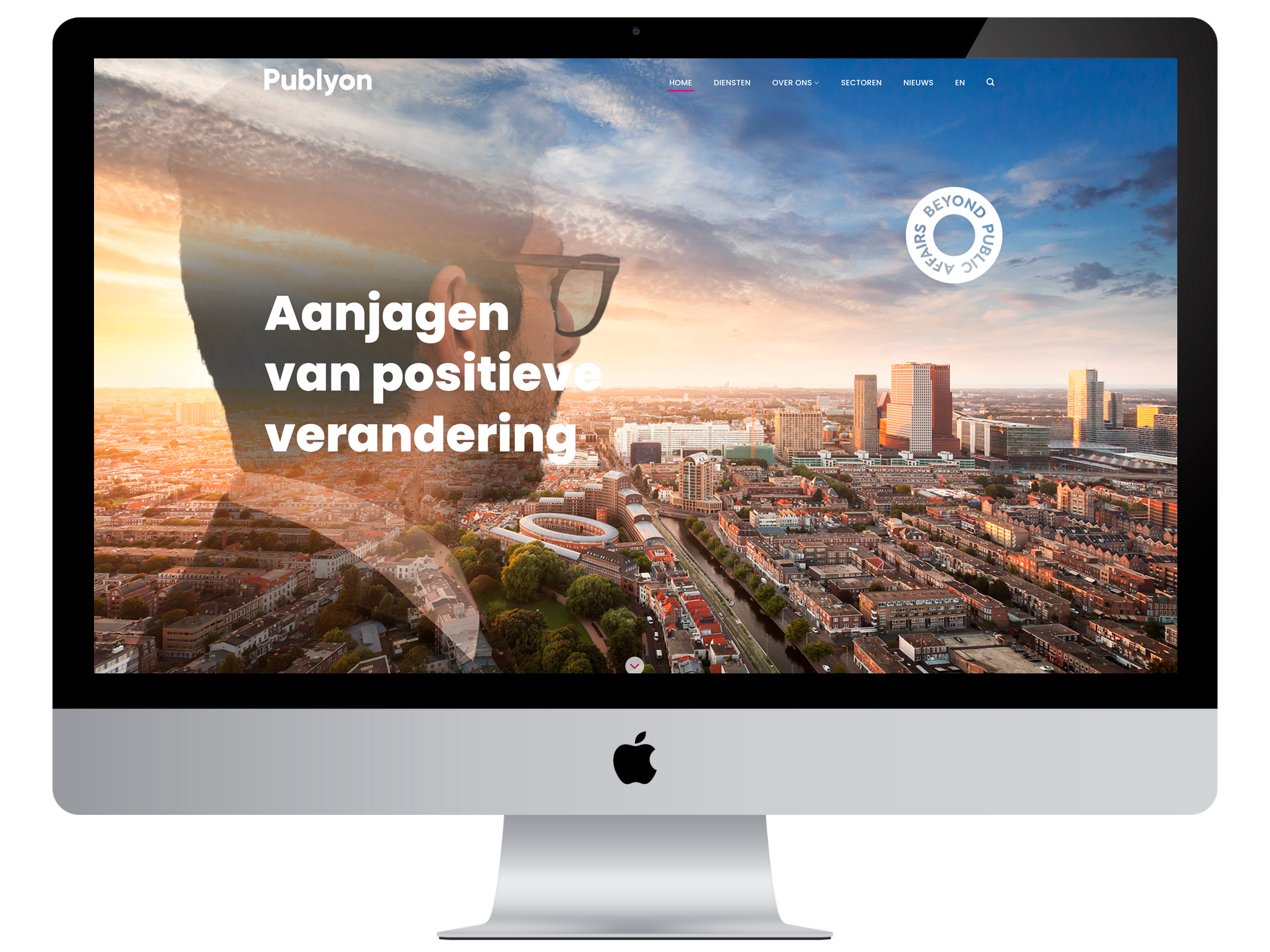
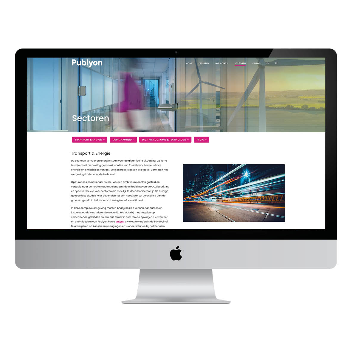
Publyon is the new name of DR2, a Dutch-origin public affairs agency with offices in The Hague, Utrecht, Brussels, Copenhagen, and New York. The name change coincided with a refinement of their services. A similar refinement was desired for the visual identity on their website. This was the task given to Brandcode by Publyon. You can view the result here.

“A good website has a distinctive and recognizable style, which essentially says everything about the brand.”

Tom Straathof
Developer
Portrait Photography in a More Relaxed Style

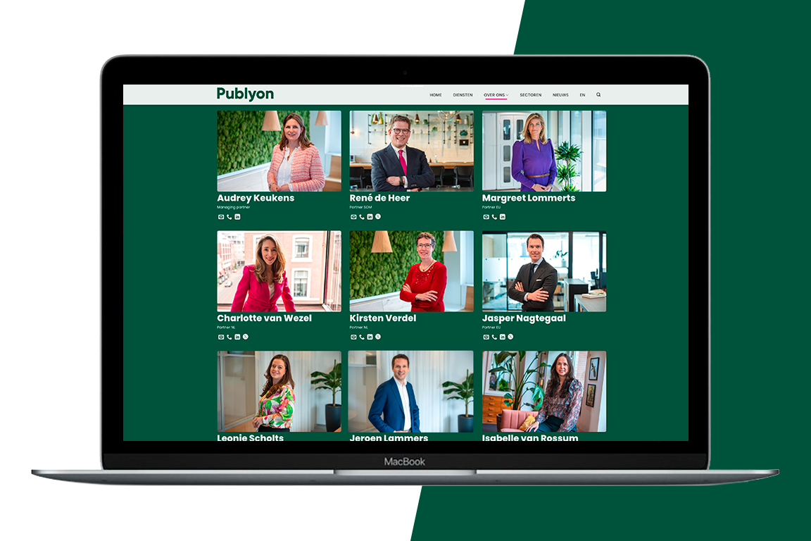
Public affairs advisors operate at the highest executive levels, traditionally adhering to formal etiquette. However, there is also a trend toward more open communication and (slightly) more casual clothing styles. Publyon is at the forefront of this trend, and their employees reflect this. Our photographer chose spontaneous sessions in their own office environment. Through careful lighting, they still maintain a clear, consistent style. The team page thus contributes to the brand.

Rebranding is always high stakes. The new brand must be embraced as quickly as possible by both existing and new relationships.
Simpler and clearer

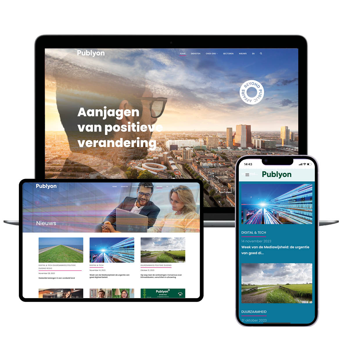
Instead of six websites, Publyon now has one international website for all locations. Visitors can easily find the right advisor with just a few clicks. In addition to web design and portrait photography, Brandcode handled the image curation and photo editing. Publyon can now select images from the image library to accompany news articles.

A New Brand is Born

A name change inevitably leads to some discomfort and a decline in brand awareness. For Publyon, however, this lasted only a short time. The name clearly refers to public affairs. And the website confidently establishes a new brand that looks toward the future. The brand promise aligns perfectly: driving positive change.
TO NEXT CASE

Coca-Cola - let’s open it!
Verdouw

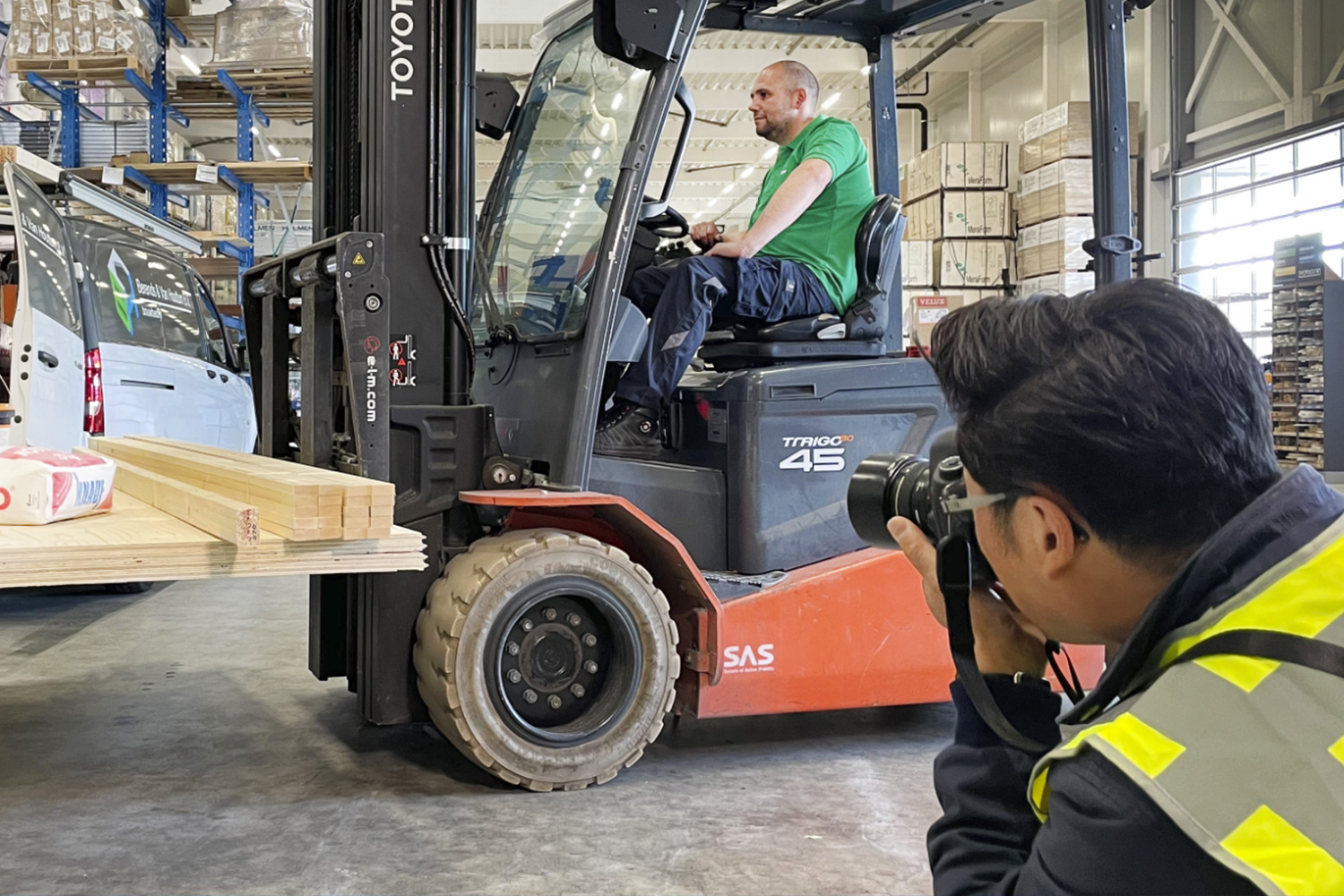
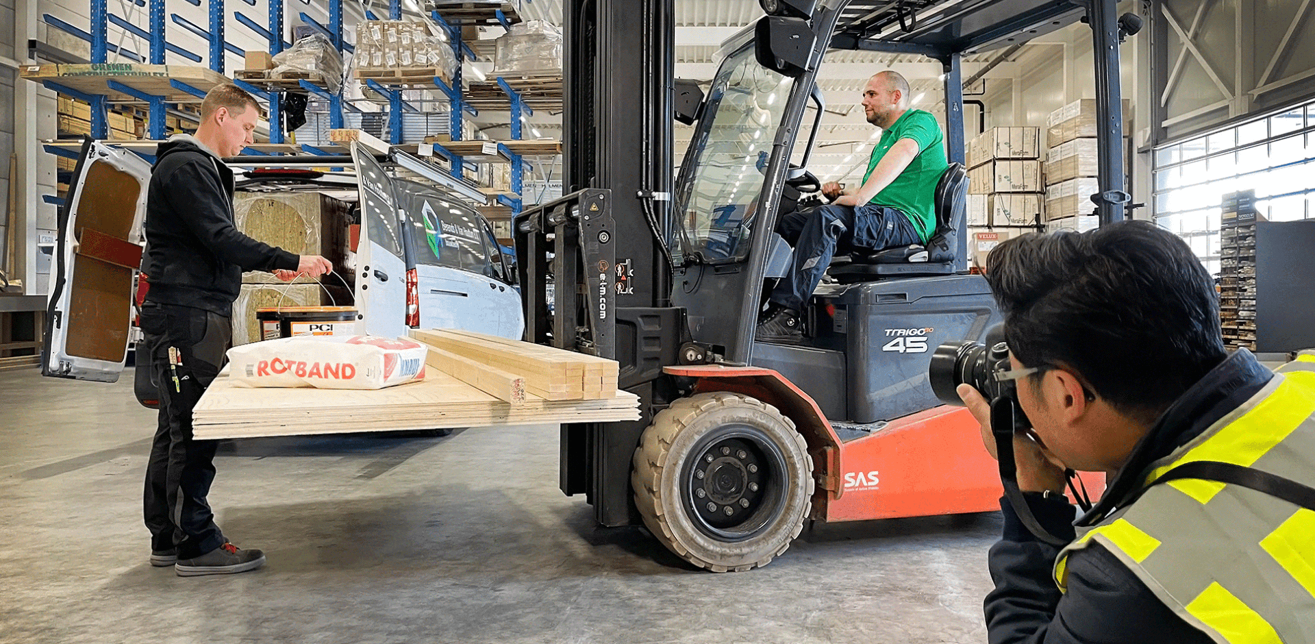
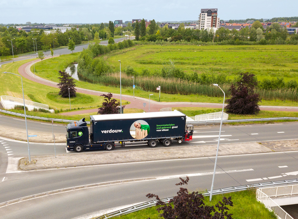
Verdouw wanted to strengthen the visual power of their brand with a new image library that reflects the versatility of their business. The photography had to align with their updated branding and be flexible for various formats, from vertical and horizontal images to circular crop-outs.

It was fantastic to capture Verdouw’s craftsmanship with images that are both authentic and representative of their brand.

Conny Huft
Fotograaf

Our Approach

Over several days, we photographed various sets, from staff in action to capturing products, the building, and trucks. The images were carefully tailored to Verdouw’s brand identity and design requirements, ensuring they are versatile for both online and offline use.

Result

The new image library provides Verdouw with an extensive collection of images that are consistent with their updated brand identity. They now have a flexible and dynamic image library that can easily be used in their marketing materials.

TO NEXT CASE

Publyon, beyond public affairs

Spirit4You

Spirit4You plays a crucial role in the Haaglanden region by supporting young people and education professionals in transitioning to further education and the job market.

However, their communication lacked cohesion. Different styles were used inconsistently, making Spirit4You not always recognizable as the sender. Additionally, a clear positioning as an authority was missing—something essential to their mission.

Through a consistent visual language and bold colors, a style emerges that radiates direction and movement.

Martine Bruyn
Designer

Visual Identity

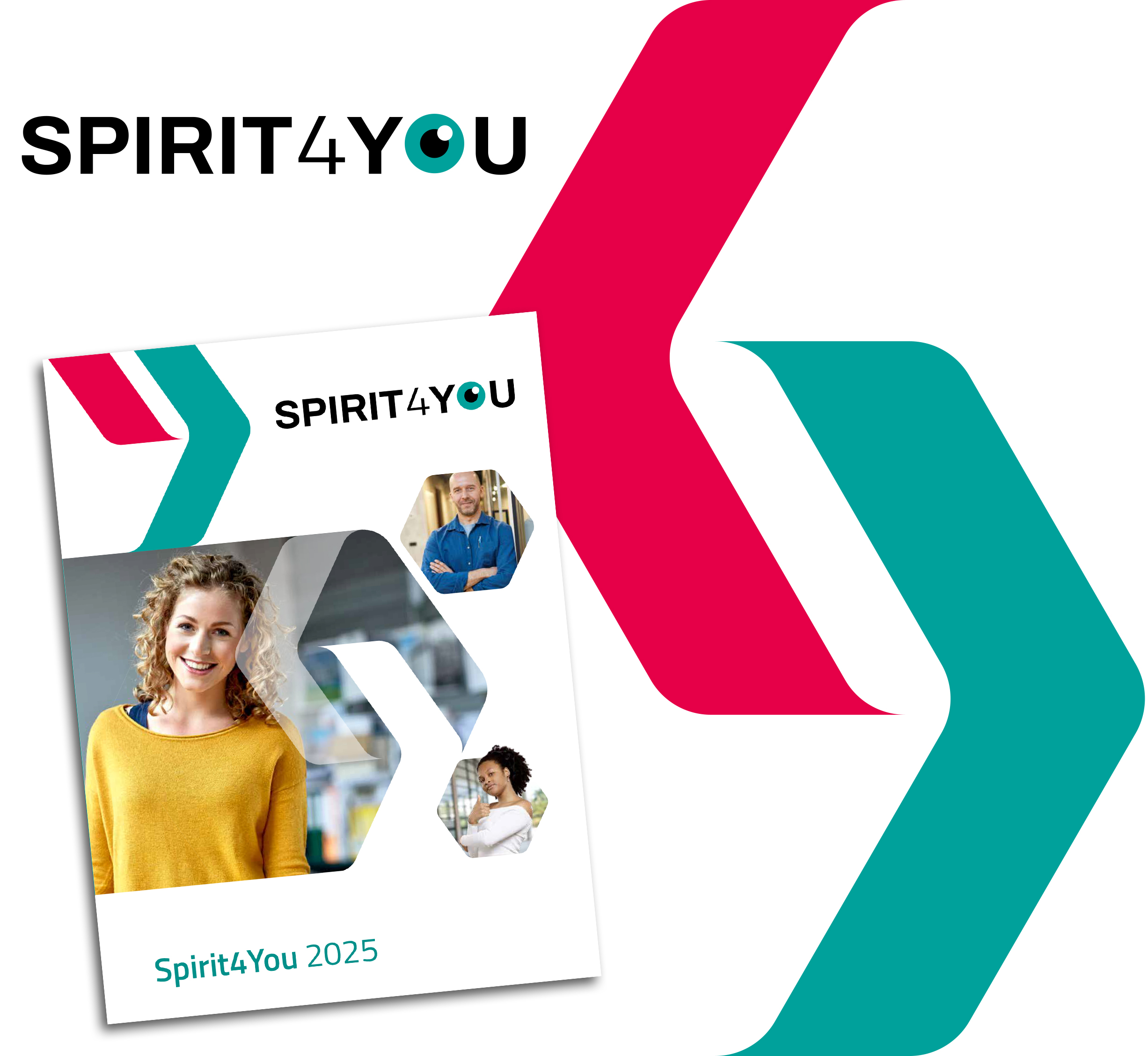
We developed a visual identity that reinforces the core values of Spirit4You: inspire, activate, and support. This resulted in a powerful logo with an ‘eye’ element, symbolizing focus on the future and guidance. The recognizable visual language with dynamic arrows expresses direction and movement, essential for the journey to further education and work. The color scheme strengthens the message: green for progress, red for energy.

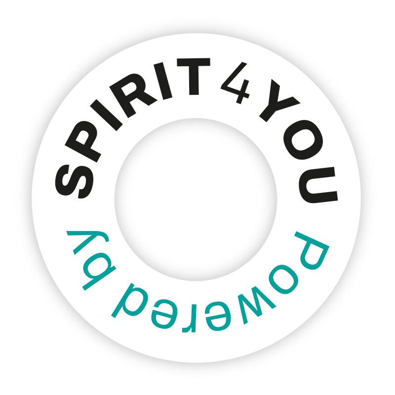
We developed a ‘Powered by’ label, so that in communications where Spirit4You is not the main brand, such as Bekijk je Toekomst, it is always clear that Spirit4You is the sender.

The Result

With the new visual identity, Spirit4You radiates authority, structure, and professionalism. The branding ensures clear recognition and strengthens their role as a trusted guide for both education professionals and young people. Spirit4You is now clearly positioned as the brand for education professionals, while remaining visible as the sender with their labels for young people. The visual identity is consistent, powerful, and reflects their mission to successfully guide both target groups into the future.